10 May 2013
28 March 2013
Evaluation Question 4
Q. How did you use media technologies in the construction and research, planning and evaluation stages?
A.Technology has been essential to our project in many ways.
Firstly, when we began doing audience research, to find the song from the band 'Quad Damage' that we should use for the video, we used the popular music streaming site 'soundcloud.com' and viewed the listener data to find which song was the most popular.
 Then, to find our core audience, we looked at the viewing data for the band's facebook page. We found the core age and gender of the people that we would be selling the music video and the band to.
 Using the soundcloud information, we decided to use the song 'Dead Side (2012)' to base our video around, and using the target demographic (male between ages 13-24) we began thinking of what kind of content our video should contain to appeal to that core audience. One group member had a copy of John Carpenter's 1988 film 'They Live' on DVD which he thought conceptually matched the tone of the song and it's lyrics. We watched it and decided that it would be the natural choice for the narrative parts of the video.
 As we had no prior experience in creating music videos for heavy metal bands, we had to seek some existing videos in order to gain inspiration and observes the conventions of such videos. To do this, we used the site YouTube.com and searched a number of other heavy metal bands' music videos including Pantera, Slayer, System Of A Down, Sepultura and Rage Against The Machine.

As we gathered ideas, we eventually figured out a shot list for the narrative section and organized a date to film the performance shots of the band. The internet proved to be an incredibly helpful source in regard to compiling audience research and music video research, as without it we would have to gather potentially outdated information from books or invalid information from speaking to people, all which would have taken a lot longer to do and would not have such a good result. We arranged casting and shooting dates, and were given digital cameras from the college to go off and shoot our music video. These digital cameras are a lot more convenient and easy to use than primitive tape cameras, as data is easily stored and transported onto computers with the use of an SD card, whereas if we used tape it is a much longer process to get it onto a computer, whereas with digital memory you are able to transfer it in seconds. We also used the college printers to print of the sheets for one of our props, a magazine decoy with OBEY messages on it.


A.Technology has been essential to our project in many ways.
Firstly, when we began doing audience research, to find the song from the band 'Quad Damage' that we should use for the video, we used the popular music streaming site 'soundcloud.com' and viewed the listener data to find which song was the most popular.


As we gathered ideas, we eventually figured out a shot list for the narrative section and organized a date to film the performance shots of the band. The internet proved to be an incredibly helpful source in regard to compiling audience research and music video research, as without it we would have to gather potentially outdated information from books or invalid information from speaking to people, all which would have taken a lot longer to do and would not have such a good result. We arranged casting and shooting dates, and were given digital cameras from the college to go off and shoot our music video. These digital cameras are a lot more convenient and easy to use than primitive tape cameras, as data is easily stored and transported onto computers with the use of an SD card, whereas if we used tape it is a much longer process to get it onto a computer, whereas with digital memory you are able to transfer it in seconds. We also used the college printers to print of the sheets for one of our props, a magazine decoy with OBEY messages on it.


After we shot our music video, we went into the editing suite in the college and begun the editing process on a Macintosh by transferring all the camera footage from the SD card onto the hard drive, and into Final Cut Pro. The software was very useful as it was simple to use and also had a lot of built-in effects which quickly made our music video look more reputable. To record a video diary of the editing and filming process, we used the Camera app on an iPhone 5.

After the finished product was completed, we uploaded it to YouTube. We shared the link around websites such as Facebook.com, YouTube.com, Twitter.com, 4chan.org (an anonymous message board), and also asked friends to watch it. We received a plethora of feedback through the internet, and then a local newspaper, the Harrow Observer (harrowobserver.co.uk) picked up on our video and wrote an article about it here: http://www.harrowobserver.co.uk/west-london-news/local-harrow-news/2013/01/29/1980s-horror-flick-inspires-college-music-video-116451-32702723/
In conclusion, the internet and other modern technology has been crucial to the successful creation of our music video.

Evaluation Question 3
Q: What have you learnt from your audience feedback?
A: This image contains most of the feedback that we received for the Quad Damage music video. During the production of the video, I dropped hints and a teaser photo on the band's Facebook page to gauge the audience's interest and also to have them anticipate the release of the video, so we would have more feedback in a shorter space of time.

27 March 2013
Evaluation Question 2
Q: How effective is the combination of your main product and ancillary texts?
A: The band we chose for the product, Quad Damage is a heavy metal band. Within the genre of heavy metal, a band's integrity is deemed very important so we made sure not to make anything look too over-produced or 'flashy', from the recording of the song down to the magazine advertisement and the digipak cover. Since the band's conception, Black and Red have been colours used in duality with one an other to represent the
band, for logos, gig fliers and previous album covers.

To carry on this convention of the band we applied it to the album cover and the magazine advertisement, focusing mainly on those two colours throughout. The tonality of the music video is ostensibly dark, with certain scenes involving a zombie at an ATM and the band's vocalist screaming into the camera. The band is also moving violently whilst they perform the song, which keeps the flow of events within the video engaging to the audience.
The album cover is effective in representing the music of the band, in that the
colours (black and red) connote darkness or evil, which is conventional in heavy
metal music. The black and red forms a swirling vortex with a horrific figure in the
center which is deemed chaotic and matches the loudness of the music and the overall
tonality. This is all done in order to essentially 'sell' the band by utilizing former
existing conventions to guide us in the right direction.
Evaluation Question 1
1.
Q: In what ways does your media product use, develop or challenge forms and conventions of real media products?A: Our music video is fairly conventional in regards to the Heavy Metal music genre - Heavy Metal music videos typically feature performance shots of the band playing, occasionally interweaved with a narrative and/or a concept. Our music video contains both of these things and so isn't very unconventional in that respect.

However, as we have taken a film concept (John Carpenter's They Live) and re-created it in our narrative, it isn't very common for music videos to use film concepts and apply them to music, but as the concepts from the film matched the lyrics and tonality of the song we chose (Dead Side by Quad Damage), we decided to use that idea.

We applied Andrew Goodwin's theory of Star Image within music videos in that, in the performance shots, we wanted to convey a dark mood and also look like heavy metal 'rockstars' so we chose mostly dark colours to wear, such as Black leather jackets and gloves, and chose black instruments to perform on.

Goodwin's theory of Relating Visuals to the song was also prescient in the production of our music video, as we illustrated the meaning of the lyrics into the narrative shots.

11 March 2013
8 March 2013
1 March 2013

28 February 2013
1980s horror flick inspires college music video - ''Harrow Observer''
We did not expect such recognition of our music video but here it is! The borough newspaper 'Harrow Observer' has shown interest in making an article about our music video and the band. Additionally, it was them finding us not the other way around. Marketing as its best.
1980s horror flick inspires college music video
It is the most popular article on the whole website at the moment, received 42 Facebook likes through that website and has been Tweeted 3 times so far.
1980s horror flick inspires college music video
It is the most popular article on the whole website at the moment, received 42 Facebook likes through that website and has been Tweeted 3 times so far.
10 February 2013
7 February 2013


6 February 2013
Digipak Design

This is the front cover for our digipak

This is the design for the interior, again based off the front cover concept. The white lines represent folds in the card on the digipak, and the grey lines represent the objects we will place within the design. The inlay booklet will have a card shell cut out to hold it in place, and the CD will have a regular transparent plastic shell.

This is the booklet inlay that we will include with our digipak - It contains lyrics for all the songs on the CD and has the same artwork as the album cover on the front of it, and a different design for the back of it.

This is the spine for the digipak, it has the product code from the record label and the artist/album title.

And this is the back of the digipak case. It has a barcode, track listing, credits to production of the music, the record label's copyright symbol and links to the band's web pages. The red design was drawn in MS Paint with the paintbrush tool.
5 February 2013
Why did we decide to make few sequences of our conceptual shots black and white?
The inspiration for our conceptual shots – ‘They Live’ – is using
just the same effect when Nada (main character) puts the sunglasses on and because
we followed that sequence of the film’s plot we simply recreated that idea in
our video.


Music video shots
Black and white, whether in photography or filmmaking, has
always been viewed as a deeper, more artistic expression of what was happening
either on the photograph or in the film. The basic theory and justification
explaining why this famous effect is so favourably seen in our eyes says that
it is simply because it is not the way in which our vision perceives the world.
Shorter range of tones makes everything simpler and easier to understand.


'They Live' shots


In the film as well as in our video the purpose of
sunglasses is to reveal what the world really looks like. Whoever is in possession
of them can see the sad truth about
the capitalist society in which the plot of both is happening. Black and white helps to convey easier
the connotations of sadness and simplicity of the world in which people
are only puppets of the state.

We also used one of 'They Live' scenes directly in our video.
4 February 2013
Magazine Advertisement Research
We looked at a number of existing heavy metal magazine advertisements for album releases:


From these advertisements we deduced that simplicity is key as when you are flicking through pages in an advertisement you need quick short messages to gain your attention and deliver information before someone loses interest. We applied that to our cover by putting basic information on the page without too much to look at in order not to appear daunting to a reader. We put two positive reviews by reputable sources, the name of the band (and album) with a small picture of the digipak, track listing and 'OUT NOW', along with the release date and the record label logo, small at the bottom. We used a dark background for the tone of the music and big fonts in capitals to draw attention. The picture, albeit not professional-looking displays the band as they are and so if anyone is drawn to it, they will not be disappointed.


From these advertisements we deduced that simplicity is key as when you are flicking through pages in an advertisement you need quick short messages to gain your attention and deliver information before someone loses interest. We applied that to our cover by putting basic information on the page without too much to look at in order not to appear daunting to a reader. We put two positive reviews by reputable sources, the name of the band (and album) with a small picture of the digipak, track listing and 'OUT NOW', along with the release date and the record label logo, small at the bottom. We used a dark background for the tone of the music and big fonts in capitals to draw attention. The picture, albeit not professional-looking displays the band as they are and so if anyone is drawn to it, they will not be disappointed.
TASTER 1

We have decided to provide you guys with a little taster image. We blurred it a little so you obviously do not get to see the final product which going to be finished soon! One of the most important and hardest to make scenes of our video - THE ZOMBIE MAN.
3 February 2013
Digipak Research
For our digipak, we took influence from a number of existing heavy metal album covers, ranging from the 1980s to present day. We analysed each and used them as influence to our own digipak cover.

Motorhead - Another Perfect Day
The swirling colour blend conveys a psychedelic mess of chaos which we thought could be applied to the band Quad Damage, as the music is very 'noisy', with distorted guitars and screamed vocals in parts. This cover looks aggressive which matches the band's reputation as one of heavy metal's biggest acts.

Sepultura - Beneath the Remains
Albeit simplistic, this cover contains a dark atmosphere that we also thought was relevant to our album cover. The colours red and black have been a staple in our band's (Quad Damage) previous imagery, made use of in previous CD releases as covers and also concert fliers. The skull, as an image of horror is also conventional in terms of heavy metal music as it is often associated with death and evil, which Quad Damage is also linked with.


Motorhead - Another Perfect Day
The swirling colour blend conveys a psychedelic mess of chaos which we thought could be applied to the band Quad Damage, as the music is very 'noisy', with distorted guitars and screamed vocals in parts. This cover looks aggressive which matches the band's reputation as one of heavy metal's biggest acts.
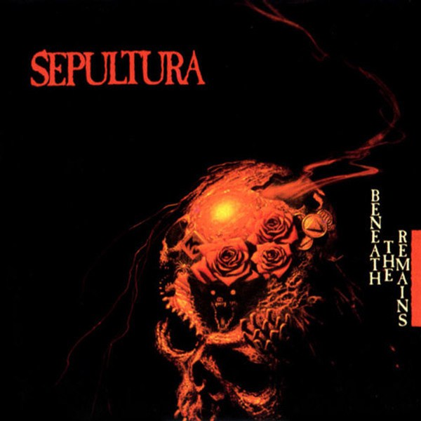
Sepultura - Beneath the Remains
Albeit simplistic, this cover contains a dark atmosphere that we also thought was relevant to our album cover. The colours red and black have been a staple in our band's (Quad Damage) previous imagery, made use of in previous CD releases as covers and also concert fliers. The skull, as an image of horror is also conventional in terms of heavy metal music as it is often associated with death and evil, which Quad Damage is also linked with.

SUNN O))) - Black One
The gritty artwork of this album cover is also clearly a heavy metal cover. The dark atmosphere conjured by the imagery was a big source of influence in deciding on what we should use for our cover art.
Finally, after gauging what kind of album cover we were looking for, one of the group members knew of a character called Giygas in a cult-classic video game by the name of Earthbound. The image of the character resembles that of a foetus/skull figure wrapped in a coil of red and black which as it is both dark and atmospheric, we thought it necessary to use. We contacted a member of deviantART who had painted a picture of this character and asked if we could use it for our media project, and he accepted.
For the interior of the product, we used a similar pattern and the liner notes were made in MS Paint using red and black for text and backgrounds to convey a similar dark tone throughout.
2 February 2013
Album cover - Inspiration
These are the album covers that we find inspiring in terms of colour use (black and red):


The German industrial rock band - KMFDM has a long standing relationship with Aidan 'Brute!' Hughes, commercial artist which designed all their album covers.

Interesting use of black and red in this symbolic album cover of Led Zeppelin's 'Mothership'.


The German industrial rock band - KMFDM has a long standing relationship with Aidan 'Brute!' Hughes, commercial artist which designed all their album covers.
Interesting use of black and red in this symbolic album cover of Led Zeppelin's 'Mothership'.
Subscribe to:
Posts (Atom)